




What Makes a Landing Page Convert? 10 Elements That Matter

A landing page has one job: turn a visitor into a lead or a customer. Unlike a home page, which introduces your whole business, a landing page focuses on one offer for one audience. When it’s done well, the same ad budget can bring two or three times more leads. Here are the elements that make the biggest difference.
1. A headline that matches the ad
If your ad says “Same-day AC repair in Phoenix”, the page should say the same thing in the first line. When people click and land on a page that talks about something else, they leave in seconds. Matching the message tells them they are in the right place.
2. One clear goal
Decide the single action you want: call, book, request a quote or download something. Remove menus and links that lead away from that action. Every extra option is a chance for the visitor to get distracted.
3. A call to action above the fold
Visitors should see what to do without scrolling. Use a button with a specific verb, like “Get my free quote” or “Book a call”, instead of a generic “Submit”.
4. Benefits before features
People care about the result, not your process. “Your house moved in one day, with no damage” speaks louder than “We use professional equipment”. List the main benefits in short lines that are easy to scan.
5. Proof
Reviews, ratings, client logos, before-and-after photos and short case results reduce the risk the visitor feels. Put proof close to the call to action, where people decide.
6. A short form
Every field you add lowers conversions. Ask only for what you need to follow up: often name, phone and one qualifying question. You can collect the rest later.
7. Speed on mobile
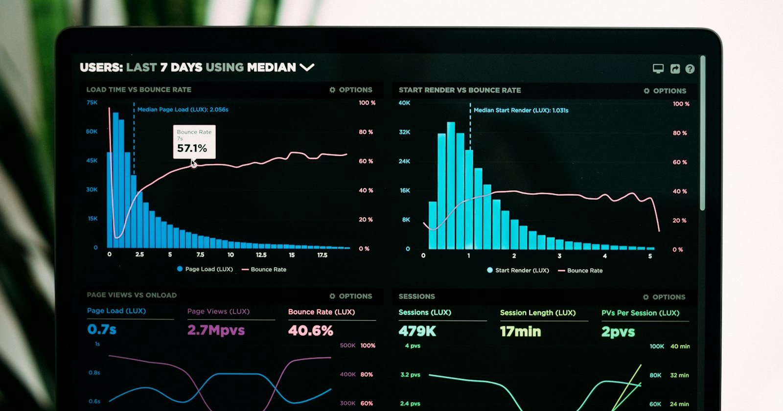
Most ad traffic comes from phones. Compress images, avoid heavy sliders and test the page on a real phone with a normal connection. If it takes too long to load, many visitors never see your offer.
8. Answer objections
What stops people from buying? Price, trust, time, fear of a bad result? Answer the most common questions on the page itself, in a short FAQ.
9. Visual hierarchy
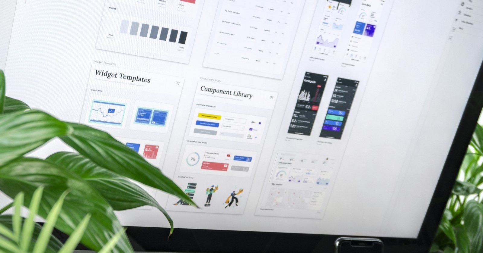
Use space, size and contrast to guide the eye: headline, benefit, proof, button. A clean page with one strong color for buttons is easier to act on than a busy one.
10. Tracking
Without tracking you can’t improve. Track form submissions, calls from the page and, if possible, which leads became customers. Then test one change at a time: headline, image, offer or form length.
A quick checklist before you launch
- Does the headline match the ad?
- Is there one clear action, visible without scrolling?
- Is there proof near the button?
- Does the form ask only what’s necessary?
- Does it load fast on a phone?
- Is every conversion being tracked?
Landing pages are never “finished”. The best ones are improved a little every month based on real data.